Role
Lead Product Designer
Year
2021–2022
Redesigned the credit card experience for 15M+ users
Sberbank's credit card had 15M+ users. The product was complex, the interface didn't help, and users made mistakes because of it. Paying only the minimum, missing the grace period, calling support for answers that should have been on the screen.
Challenge
Clients
- 01
Credit cards stack multiple concepts: grace period, minimum payment, principal balance, interest. Most users had no idea how they interact.
- 02
The screen was written in bank language. Long text explanations sat next to numbers. Nobody read them.
Business
- 01
The call center kept getting the same calls: when does the grace period start, how much to pay to avoid interest, what happens if I pay less.
- 02
Every unanswered question in the app became a support ticket.
Welcome to the credit card world
- 01
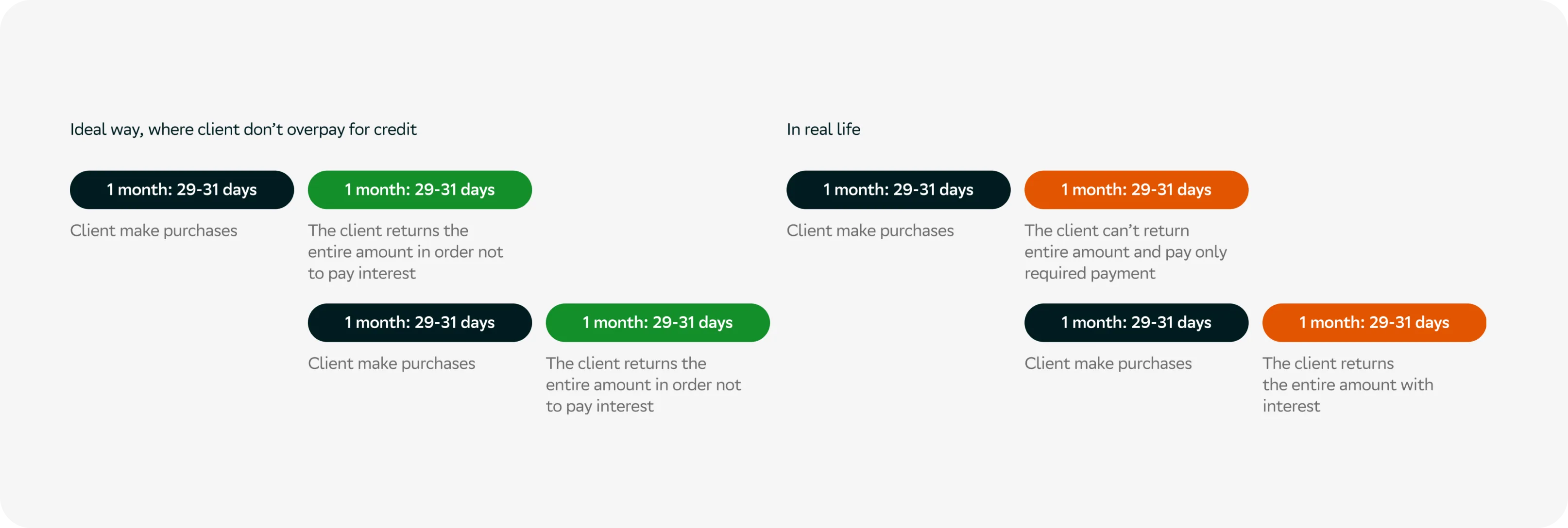
Spending money on a credit card is the easy part. Paying it back is where things get complicated. Miss the full repayment once and the grace period ends. Pay only the minimum and interest starts building on everything else. Most users didn't know any of this until it was too late.
Debt screen
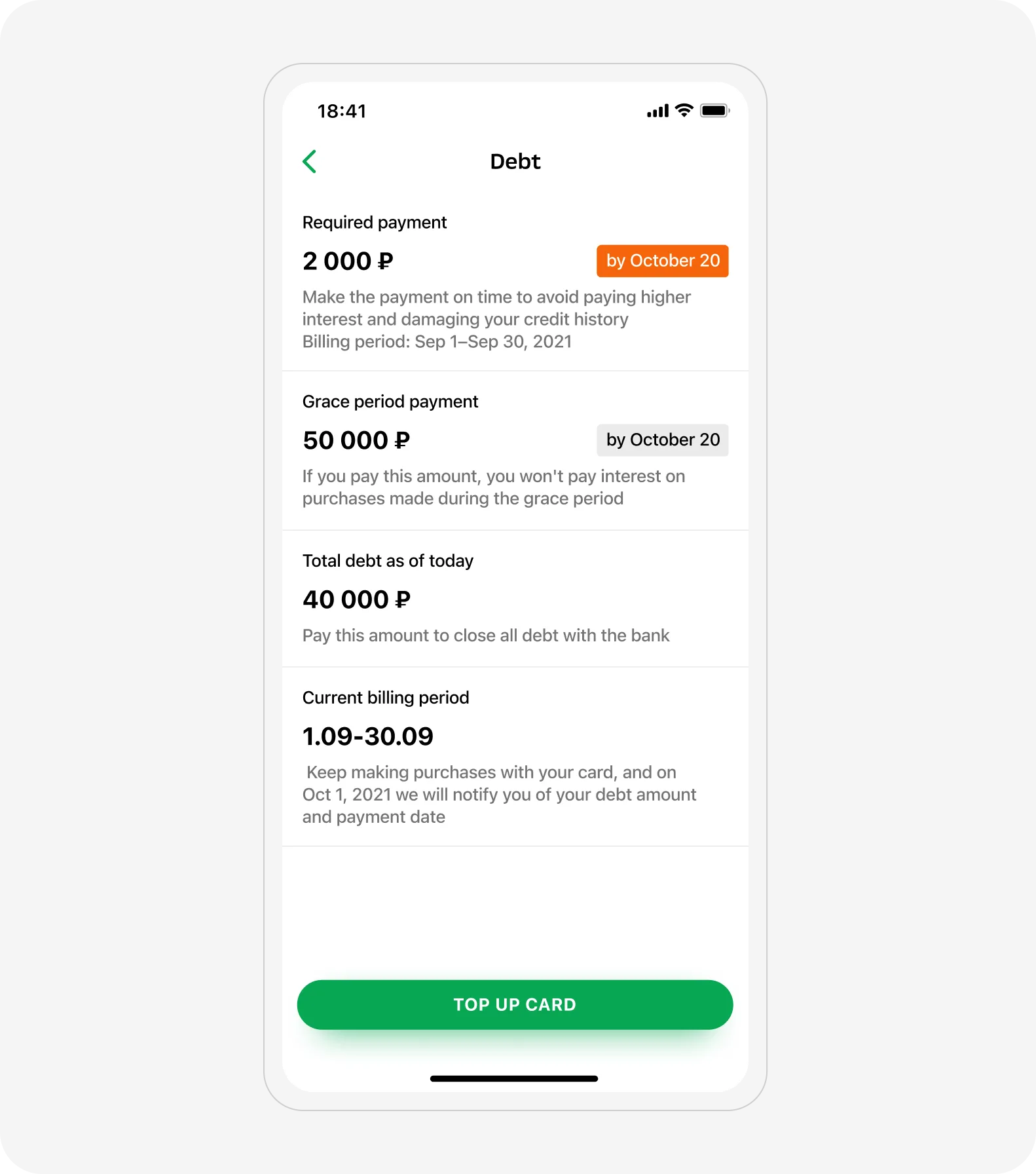
- 01
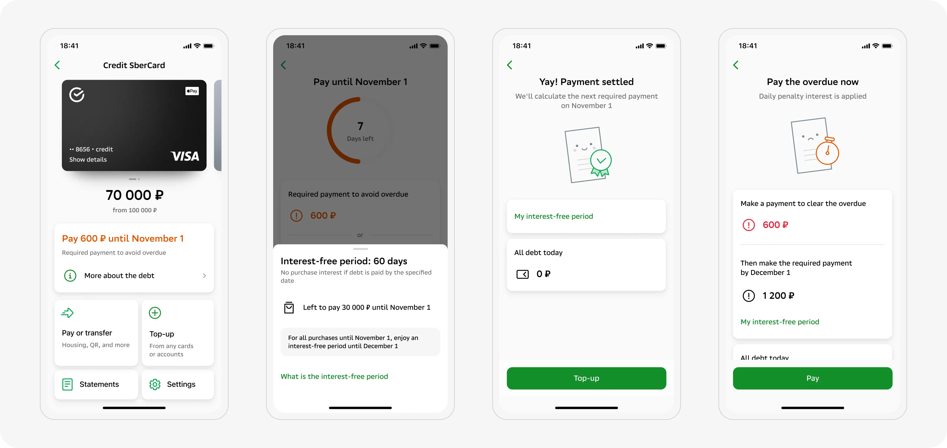
The old screen showed numbers with text explanations next to them. Users scrolled past. Nothing signaled urgency.
- 02
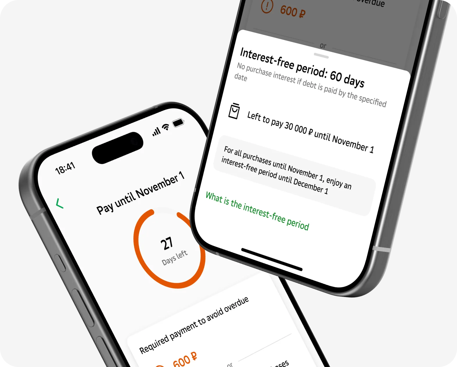
Stripped the bank copy. Rebuilt around one question: what do you need to pay, and what happens if you don't.
New 120-day grace period
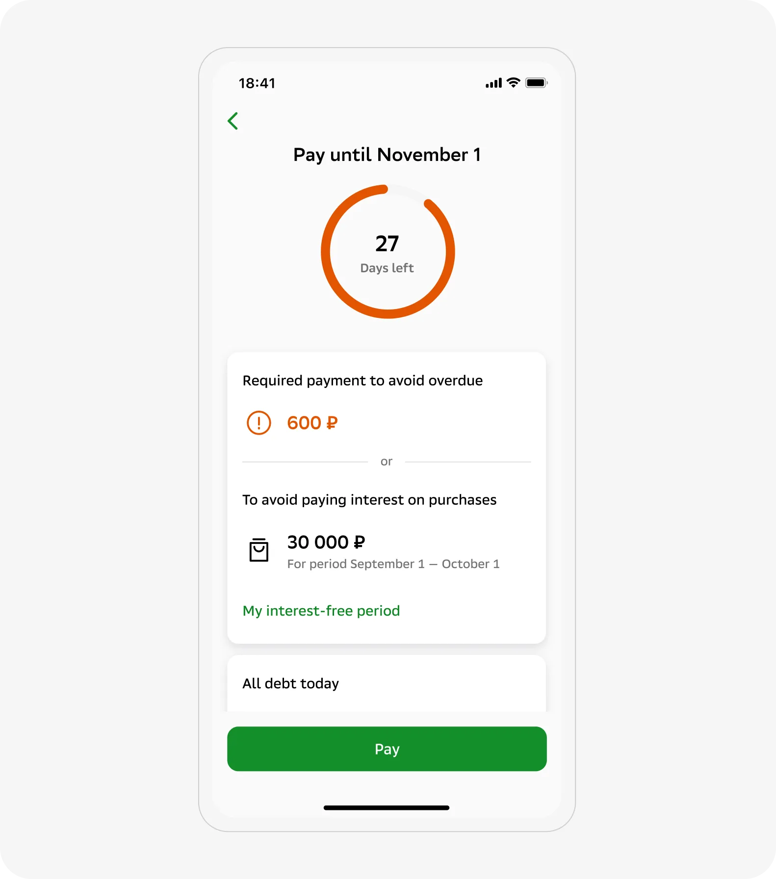
- 01
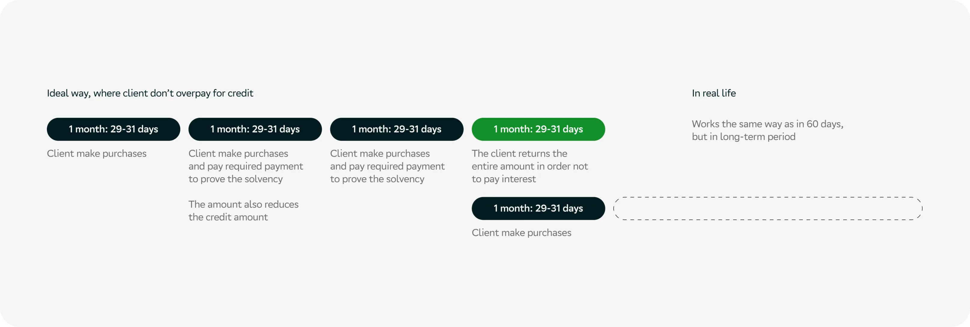
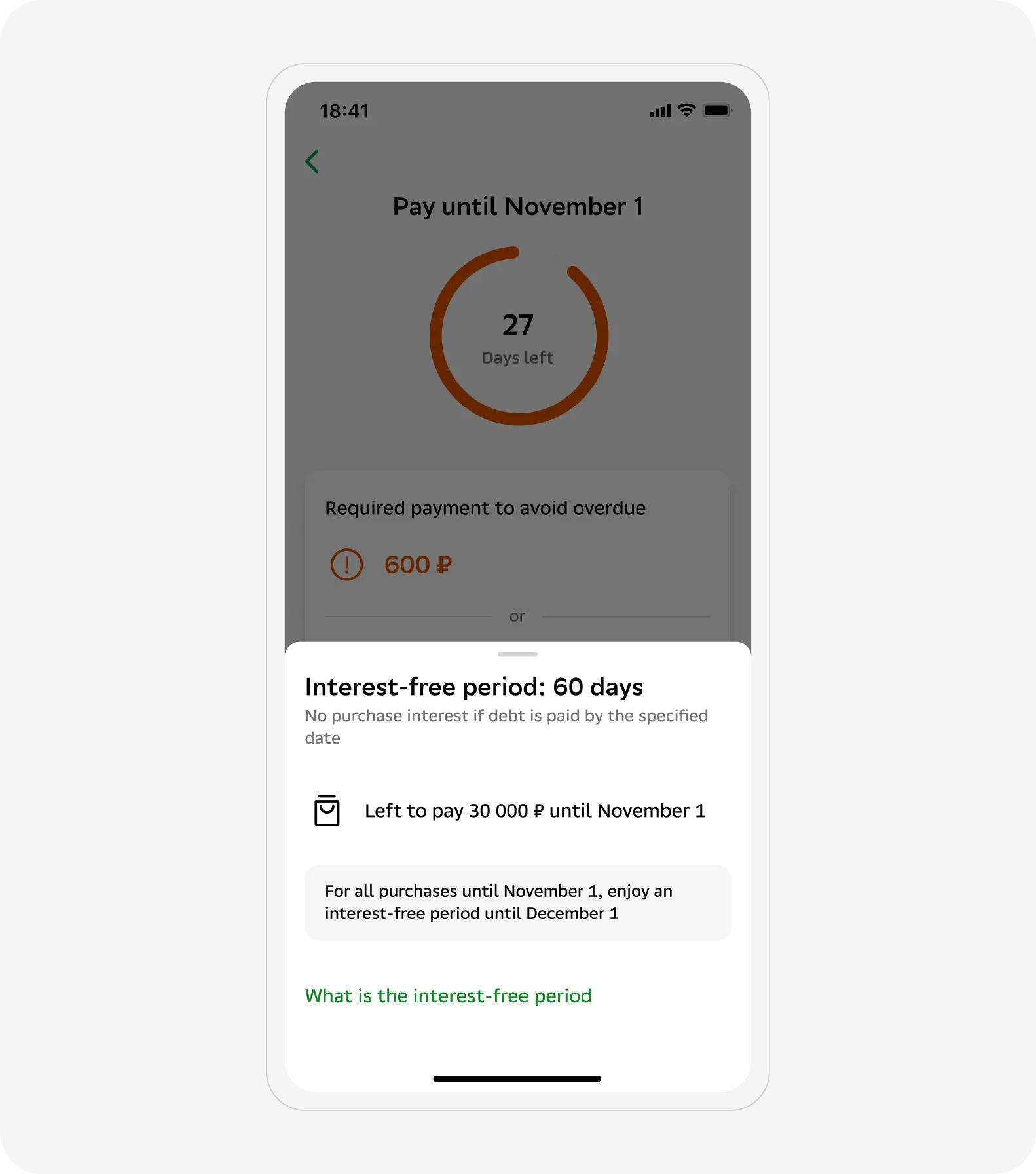
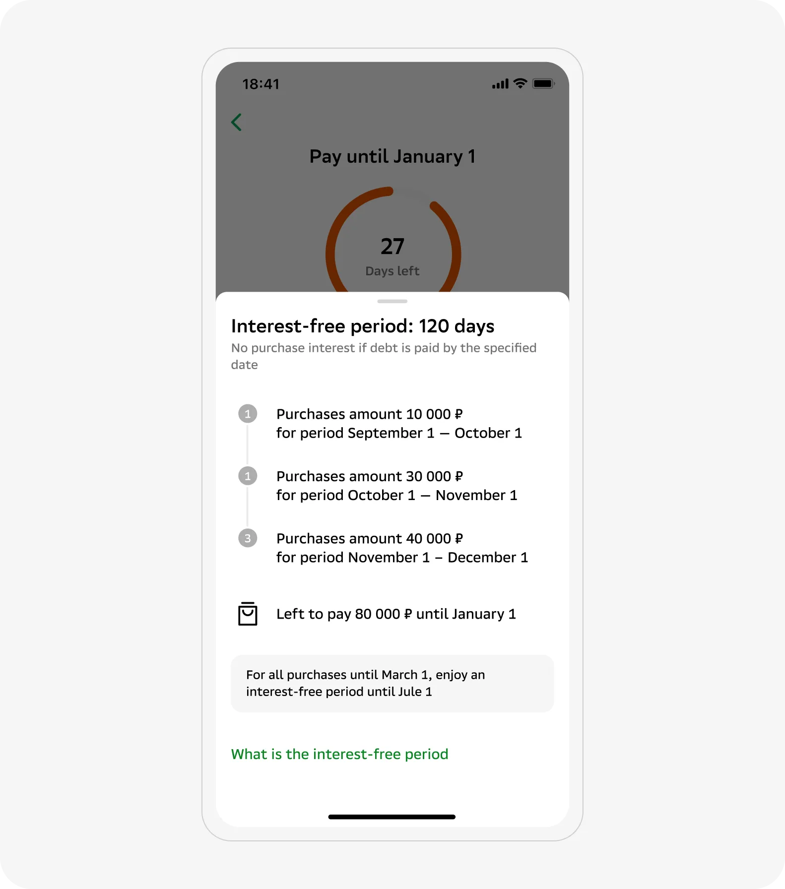
The product came with an aggressive campaign targeting existing customers. The interface didn't need rethinking. The same structure that made 60 days clear made 120 days clear too.
- 02
Scalability wasn't a goal. It was a side effect of getting the basics right.
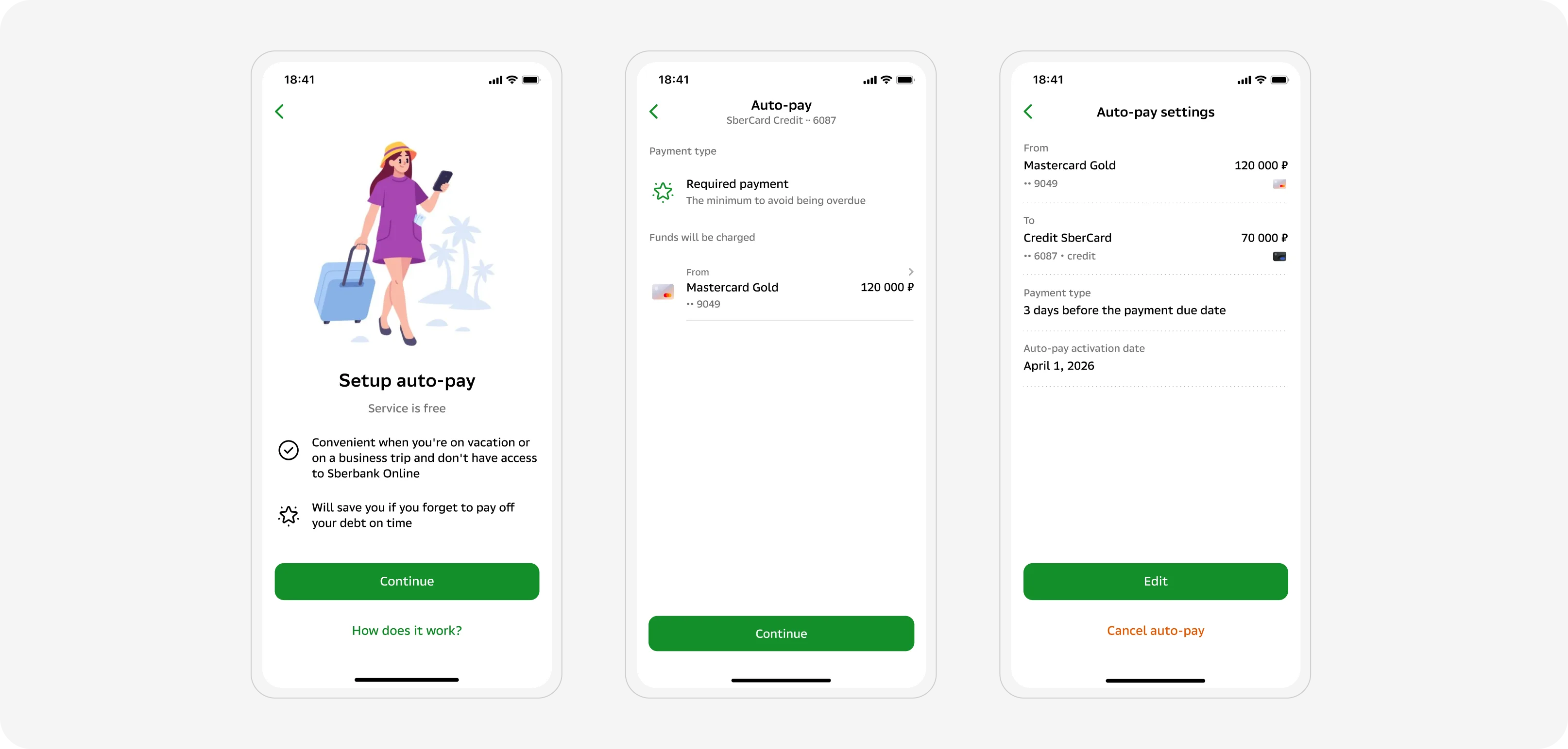
Auto-pay: when clarity isn't enough
- 01
Adoption was low. Not because it was hard to find, but because users didn't know what they were agreeing to.
- 02
Added an explanation screen before setup and an SMS one day before each charge.
- 03
First-step conversion: 4% to 31%. Overall adoption barely moved.
- 04
Convenience doesn't beat fear of losing control. That was the real finding.
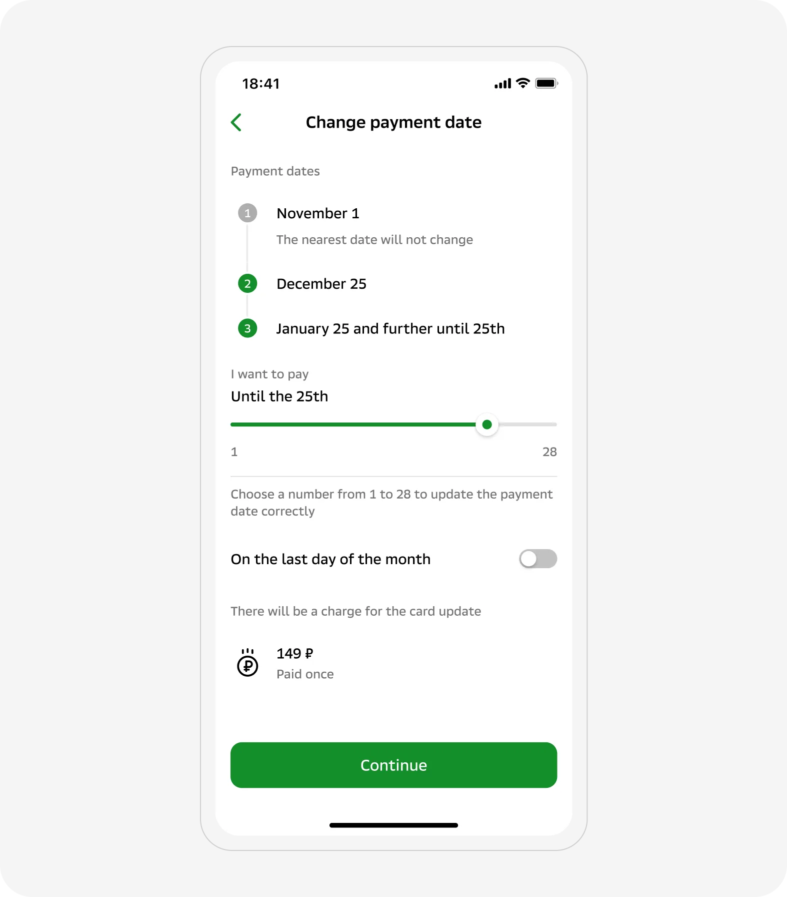
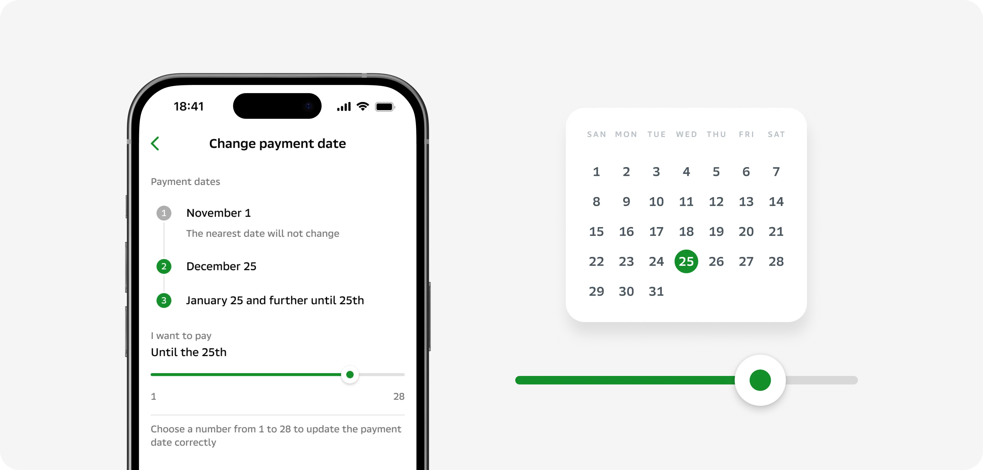
Payment date
- 01
In prototype testing, users couldn't tell if they were changing the next payment only or all future ones.
- 02
Added a timeline with real dates: move the slider, see exactly what shifts.
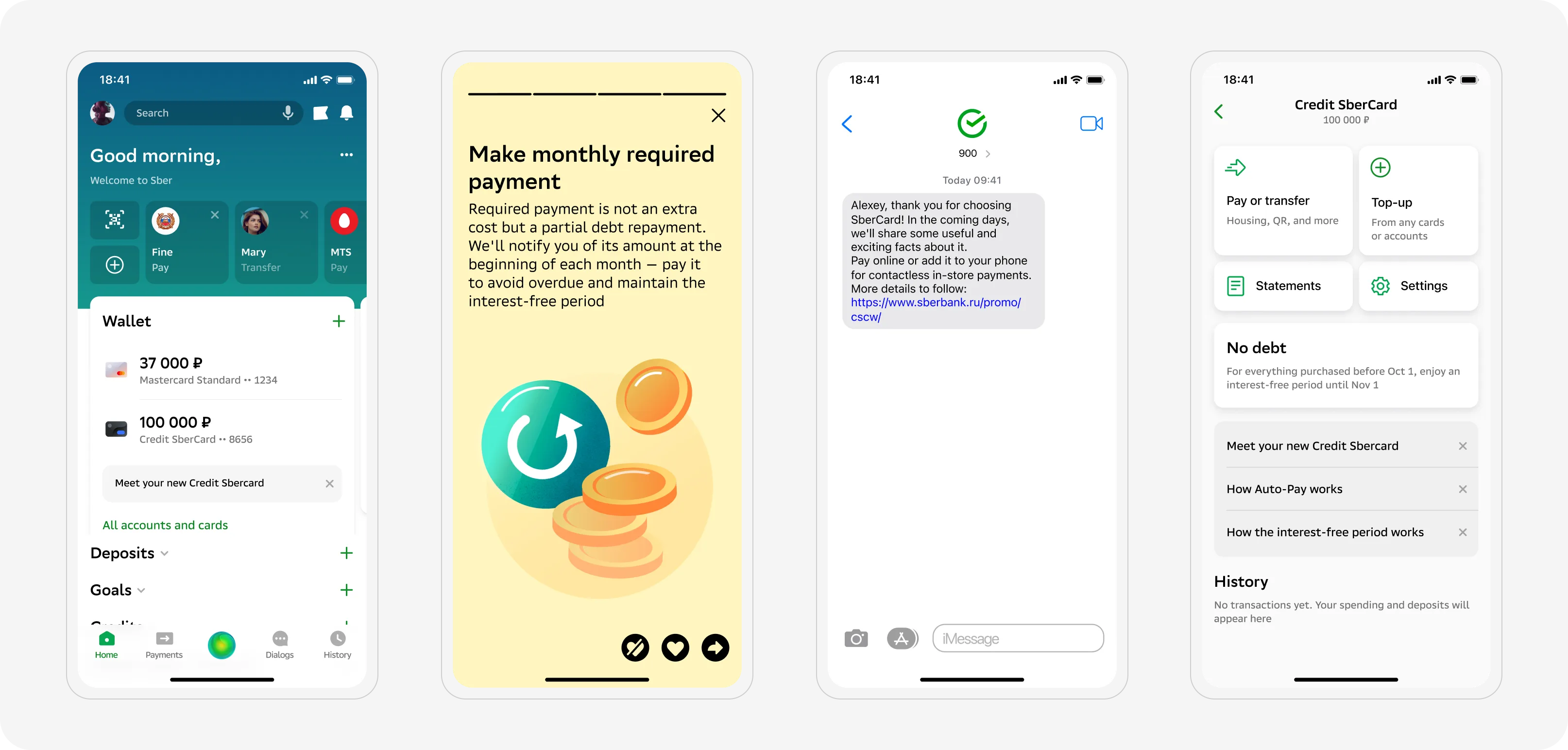
Onboarding
- 01
The interface alone isn't enough for a product this complex.
- 02
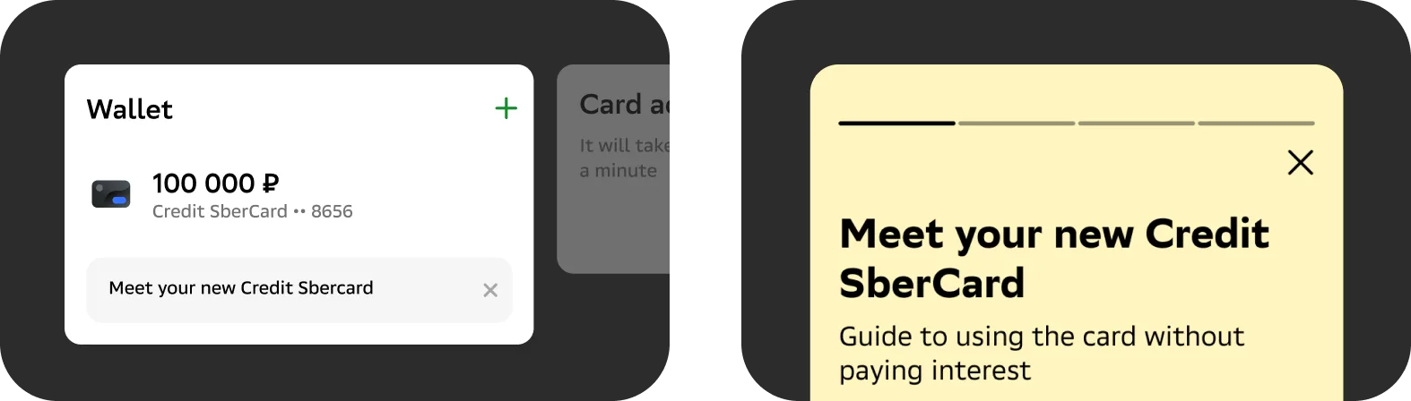
Designed a lifecycle-triggered system: contract signed, first transaction, first payment due.
- 03
Each touchpoint delivered one piece of information exactly when it was relevant, via SMS or in-app.
Results
- 01
88% clients correctly understood: paying only the required amount means losing the interest-free period.
- 02
98% gave 5 stars in-app survey on the debt screen.
- 03
4% to 31% first-step conversion on auto-pay setup.
Takeaway
Auto-payment taught me something I didn't expect: convenience doesn't beat fear of losing control. The conversion on step one tripled, but total adoption barely moved. That gap is the real insight. It changed how I think about trust in financial products.